Introduction
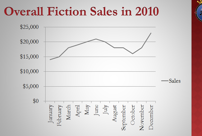
A chart is a tool you can use to communicate your data graphically. Displaying charts in PowerPoint allows your audience to see the meaning behind the numbers, and it makes showing comparisons and trends much easier.
In many ways, charts are an ideal way to present information in PowerPoint 2010. They give you an illustration of your data. A chart can help you show your audience what your data means and why it’s important. Plus, they can add visual interest to slide shows that are otherwise filled with text.
Types of Chart


Inserting charts
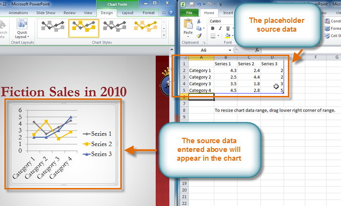
PowerPoint uses an Excel worksheet as a placeholder for entering chart data. Therefore, when you insert or edit a chart in PowerPoint, an Excel window will automatically open.
To insert a chart:
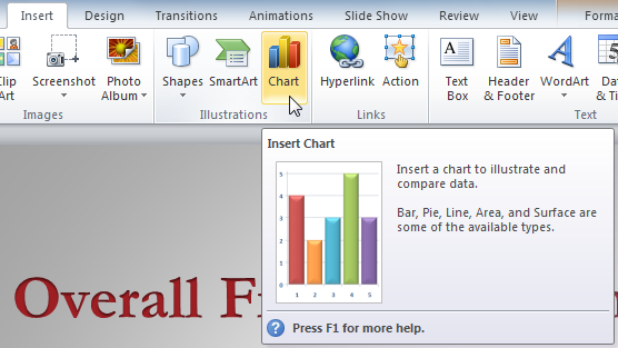
- Select the Insert tab.
- Click the Insert Chart command in the Illustrations Group. The Insert Chart dialog box will appear.
- Select a category from the left pane of the dialog box, and review the charts that appear in the center. If you are unsure about which chart best fits your needs, review the interactive on the previous page.
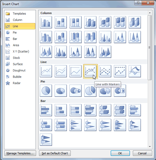
- Select the desired chart.
- Click OK. An Excel window will open with a placeholder for your data.
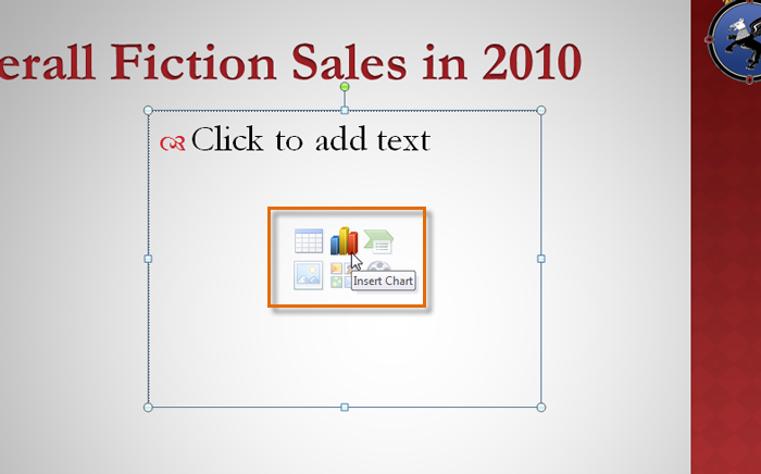
If a slide layout has a content placeholder, you can also click the Insert Chart command to insert a new chart.
To enter chart data:
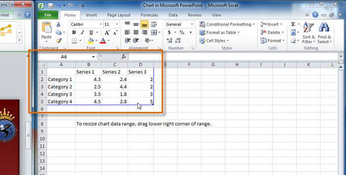
The data that appears in the Excel spreadsheet is placeholder source data that you will replace with your own information. The Excel source data is used to create the PowerPoint chart.
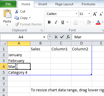
- Enter your data into the Excel spreadsheet.
- If necessary, click and drag the lower-right corner of the blue line to increase or decrease the data rangefor rows and columns. Only the data enclosed by the blue lines will appear in the chart.
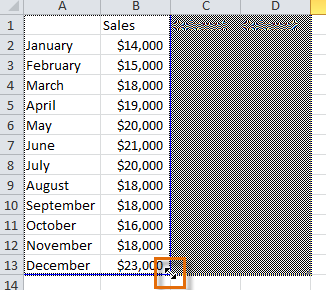
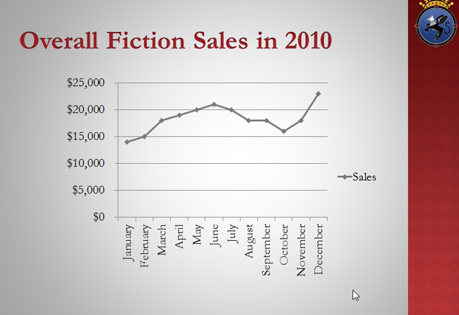
- Close Excel. You do not need to save the spreadsheet. The PowerPoint chart will update to reflect the new source data.
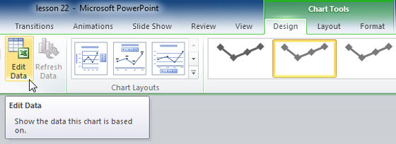
You can edit the chart data at any time by selecting your chart and clicking the Edit Data command in the Data group on the Chart Tools Design tab.
Modifying charts with chart tools
There are many ways to customize and organize your charts. For example, PowerPoint allows you to change the chart type, rearrange a chart’s data, and even change the layout and style.
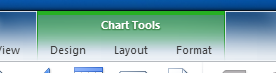
Once you insert a chart, a set of chart tools will appear on the Ribbon. These are only visible when the chart is selected. You can use the three tabs grouped under Chart Tools to modify your chart.
To change the chart type:
- From the Design tab, click the Change Chart Type command. A dialog box will appear.
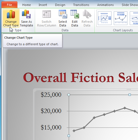
- Select the desired chart type.
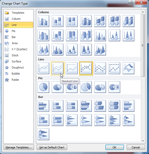
- Click OK. The chart will update to reflect the new chart type.
To switch row and column data:
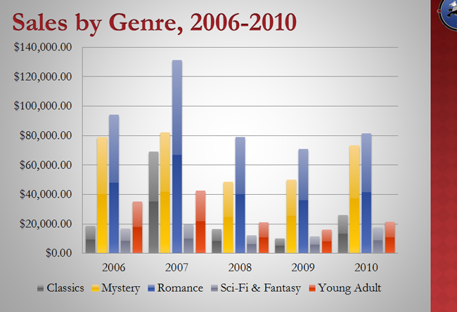
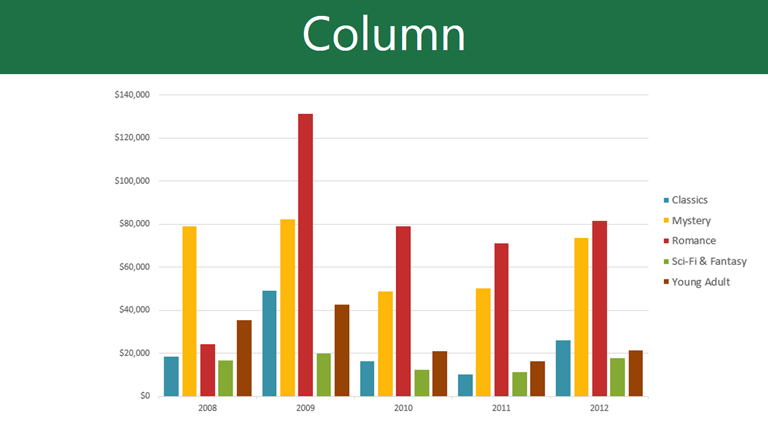
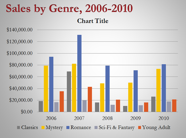
Sometimes when you create a chart, the data may not be grouped the way you want it to. In the clustered column chart below on the left, the Book Genre Sales statistics are grouped by genre, with a column for each year. However, you could also switch the row and column data so the chart will group the statistics by year, with columns for each genre, as in the chart on the right. In both cases, the chart contains the same data; it’s just organized differently.
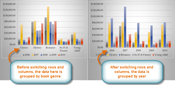
- Select the chart.
- From the Chart Tools Design tab, select the Edit command in the Data group. The Excel placeholder will open.
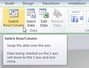
- Return to your PowerPoint slide. Select the Switch Row/Column command in the Data group.
- The chart will adjust the data.
To change the chart layout:
- Select the Chart Tools Design tab.
- Click the More drop-down arrow in the Chart Layouts group to see all of the available layouts.
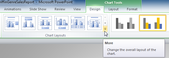
- Select the desired layout.
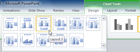
- The chart will update to reflect the new layout.
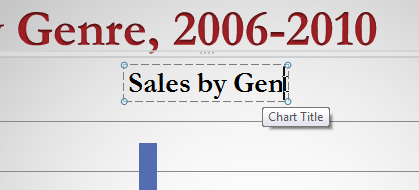
Some layouts include things like chart titles and legend labels. To change them, place the insertion point in the text and begin typing.
To change the chart style:
- Select the Chart Tools Design tab.
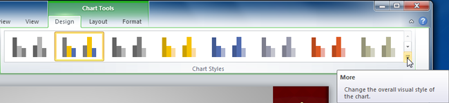
- Click the More drop-down arrow in the Chart Styles group to see all of the available styles.
- Select the desired style.
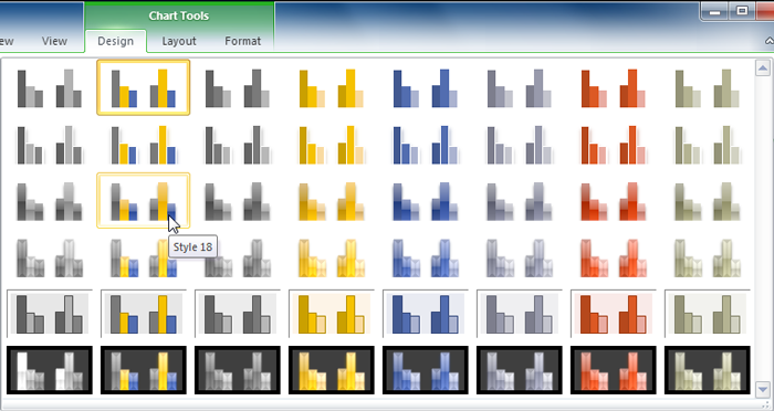
- The chart will update to reflect the new style.